Crystal

Here we are in May already and I haven’t posted my 2018 Trends alert! I just want you to know that I spent countless hours scouring Pinterest,…

Read more

Show all posts writed by Crystal
Crystal Author

2018 DESIGN TRENDS

2018 DESIGN TRENDS

Here we are in May already and I haven’t posted my 2018 Trends alert! I just want you to know that I spent countless hours scouring Pinterest, Houzz, browsing magazines,  and searching through other blogs to see what’s HOT and what’s NOT. While this is a huge under taking I feel it’s my duty to keep you up to speed on everything that’s new and trendy….in case you’re in to that sort of thing. It’s also something that can make even the most confident feel as wilted as last week’s lettuce. I now know that I.am.not.trendy.

Before I start listing the hots and nots, please understand that just because I say something is trending doesn’t mean it is in your neck of the woods, some trends are regional, and when I list the things that I think are dead or dying, don’t send the Trend Police or send me hate mail, these are my personal opinions. You may agree or not as you see fit.  As always, design is a personal choice, you might still love mauve and blue with ducks and geese wallpaper border, and that’s fine. It’s your home! Your rules! So always use what you love, no matter what the trendy people say. Fair warning. This is a long post, there’s a lot of info here.

For the those who want to be on the cutting edge of design, you don’t have to embark on a whole house renovation to update your look.  Want to try a new color? Use it in throw pillows, bedding and maybe art. Trends come and go. It can be an expensive proposition to keep up, plus you’ll never be really happy if all you do is chase the next big thing.  I say stick with the classics, adding a couple of well thought out fun accessories will give you a whole new look and you’ll be happier in the long run.

Some 2018 Trends are carry overs from 2017, we’ll see how long they last.

Let’s begin with what’s HOT for 2018:

CONCRETE. Anything made of concrete, we’re talking tiles, hello and thank you for this trend, Joanna Gaines, the matte concrete tile look is hot. If you can’t afford to rip out your floors to add new tile, try a stencil and paint to cover old linoleum to get the look. A couple of bloggers have even painted old porcelain tile. Google painting and stenciling porcelain tile and you’ll see several tutorials. Lamps of concrete, tables, planters, even chairs (um, not happening at my house), and mortar applications for walls are getting a lot of buzz. Still hot: Concrete counter tops.


PLANTS. Did they ever really go away? 2017 showed plants, both real and faux exploding. It’s like the 70’s all over again. Except Faux has really stepped up its game. And the stigma of using fake is gone. Don’t have a green thumb? Faux it! Live in a cave? Faux to the rescue. If you are using live plants, at least take a little time to research its light and water needs before bringing a new one home.


NATURAL WOOD. Natural, scrubbed or bleached wood is back….not that it was ever completely gone, but thankfully we are seeing more natural wood furniture. Mixed with painted pieces in a room, it gives warmth and contrast.

BLACK cabinets in kitchens. Black in general. I’m OK with this. I actually love black cabinets. I know, right?? Surprised? Me too.

GREEN is still big in the color trends, it also started in 2017 but has continued its popularity into 2018. Every shade of green. Use it on your walls, in pillows and throws, botanicals as art, on wallpaper. You can’t go wrong using green, there is a shade of green for every area in the home.

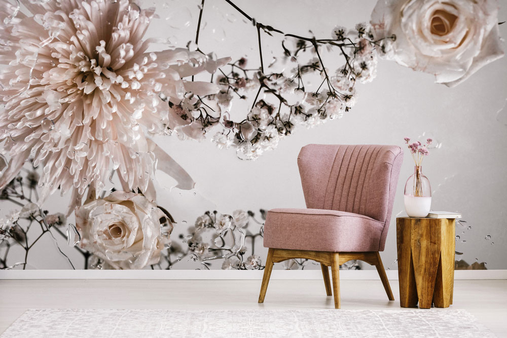
WALLPAPER. Wallpaper has been trending for a few years but in the last two it’s become a thing. Rent? No worries, there are peel and stick varieties in many colors and patterns. Want a more permanent installation? Traditional paste papers are easily found online and in some paint stores. One of the biggest trends this year is over-sized florals. Huge, ginormous flowers. Used in the right setting, say a bedroom for a teen, or in a master with bold color, a large scale floral can be stunning. Use in a dining room to add drama.

wallpaper by Ellie Cashman, photo by Ellen Mesu

BRASS. Yep, brass has continued its rise and is one of the biggest trends in bathrooms and kitchens. I love brass, I’ve always loved genuine old brass.  I’ve never been a fan of the cheap, shiny stuff but give me an old brass fixture that’s been allowed to patina and my heart beats a bit faster. Want to add brass to your home?  Choose unlaquered brass fixtures. Search Thrift stores for candlesticks and small containers.

POLISHED CHROME. Polished chrome, another classic finish that deserves more use.  I used polished chrome in my master when we replaced our old satin nickel faucets. It reminds me of my childhood home.

MINIMALISM. WHAT???  Yes, after decades of over the top décor and lots of stuff, many designers and homeowners are now craving a simpler, streamlined look. This does not bode well for the sanctuary. I mean I HAVE been purging and decluttering, but come on, I like my stuff. I also like the look of modern, minimal loft apartments but I don’t think I’d be comfortable in the long term….. after 5 minutes I’d be measuring those bare walls for art.  I’m a collector, therefore I hoard. All kidding aside, I am enjoying my “simplified” look, although if you ask Mr B, he’d say I haven’t simplified all that much, if at all. I just bought different stuff.  That’s a post for another day.

BOLD COLORS. I talked about the colors of the year in this post.  Not ready to commit to Ultra Violet (Pantone’s color of 2018) on your walls? Use it in small doses, say a pillow or two, or  lamp shades or a big, soft cozy throw.

ACCENT COLORS. Tired of all neutral rooms? (that isn’t possible…..is it???) Add some “Millennial pink,” that dusty pale pink that is so pretty and soft, add this wherever you want a wisp of color. Lavender is still around as well, find it pillows, throws, tablecloths and paint. If you have a piece of furniture you want to make a focal point, consider painting it pink, or lavender.  Blue is still having a moment. But when is it not? Blue is one of those colors that never really goes away, I mean come on, Hello Miss Mustard Seed with her classic blue and white home and let’s say Hi! to Thistlewood Farms new blue and white living room.  Blue in every shade is still a winner.


VELVET AND LINEN: velvet throw pillows and bedding. Anything Linen.

BAR CARTS. Yep, those wheeled darlings of the 50’s and 60’s are making a comeback. You can use them as plant stands, juice or coffee bars, for cosmetics in a bathroom, as a nightstand, in the nursery or geez…here’s a thought, use it as a bar cart. Look in vintage shops, and on-line. New or vintage, these are proving to be hardworking and stylish additions to any room. Go retro or find new made from brass for the retro look, or wood for cottage and country styles.

BLACK STAINLESS APPLIANCES. With darker colors trending,  this finish works well in modern style kitchens. Not my thing, but then again we’ve already established I’m not trendy.

ON THE CUSP. Fading a bit: Some say all white rooms are going away. GASP! NOOOOO. Let the wailing and beating of the chest begin. I don’t believe this myself, I don’t think this is in any danger…..yet.  A few designers predicted the death of gallery walls last year but they refuse to go away. Whether they should or not is up to you. Milk Glass has hit its peak again and seems to be fading. I think it’s charming but a little goes a long way. Personally I’m over it. All white kitchens. Designers are predicting the death of white kitchens. I don’t know how I feel about that prediction. I’ve always wanted a white kitchen….. since the 70’s. I’m not sure white is going away any time soon, but I could be wrong!!

SIGNS. Are still hanging on (no pun intended) although I have no clue why. I don’t need a sign that reads “Bathroom” when I’m in the…..bathroom. Pretty sure I know what room I’m in. And the Farmhouse sign won’t be in my home, I don’t live in one, and if I did live in one, I wouldn’t need a sign announcing to my guests that they are in a farmhouse. Some signs are clever and cute. But over done. So let them go. Authentic vintage signs are hotter than ever. Those are a definite DO!  Can’t afford authentic? There are some reproductions that look genuine. Look on Etsy and for those made in the U.S. from salvaged materials. The trend of framing music lyrics, Bible verses, and poetry is hot and that’s another DO for me.

Finally the NOTs. Here are the things I think are worn out and just over used.  Cotton stems, dollar store cow art, knock off galvanized anything, (genuine, crusty galvanized gets a yes!), burlap. Although burlap in an industrial setting, say for hanging light shades is still trendy. Cow art in general, unless it’s an original photograph, or painting, I’m also not into tiny statues of livestock, except sheep, or maybe goats. OK!!! I give! I still like some livestock and dog statues. The a fore mentioned farmhouse signs, NOT. Lambs ears…. DEAD. After I saw lambs ears in about the 10th blog last year I was already sick of it. Use seeded eucalyptus instead, it never seems to go out of style. Or just use clippings from your yard.

Every one should live in a home that suits their individual style, has collections that speak to the heart, feels safe and provides security from life’s general ups and downs. Use what you love. No matter what “they” say or predict. “They” also predicted the death of Shabby Chic in the 90’s. Rachel Ashwell smiled, thanked them and then marched to the bank. She’s still smiling and has published more books and expanded her line of fabrics and furniture, even wallpaper. Just sayin.

Whether you are “on trend” in your home or stick to the classics, create your sanctuary, one room at a time. Create the home you see in your heart.

All photos unless otherwise captioned are from Google.

A LITTLE PIECE OF AMERICAN HISTORY

A LITTLE PIECE OF AMERICAN HISTORY

Hey y’all, today I’m going to talk about a bit of Americana.  I enjoy learning about the things of “yesterday,” whether it’s recent history or back a century, old things touch my heart and pique my curiosity. Today’s subject is a new fascination and I thought you’d get a kick out of it. Several years ago I was on the hunt for shaving mugs to decorate Mr B’s bathroom. I started with the Old Spice mug and brush that belonged to my Grandfather, adding shaving mugs and old brushes as I found them. I picked up two white glazed mugs thinking they were shaving mugs and they were part of the display for years.

My Grandfather’s shaving mug and brush

In the midst of my almost constant rounds of purging (by purging, I mean moving crap from from one room to another so it looks like I got rid of some stuff… don’t judge) I looked at the shaving mugs and went, “hmmm, they don’t really look like shaving mugs….” After taking a closer look, I decided they’re really coffee mugs. They’re heavy and well made and marked, “Victor” on the bottom so of course I had to hook up with my bestie, Google, and do some history hunting. Turns out they come with a pretty neat history and now have pride of place in a kitchen cabinet next to my hot chocolate supplies. So much for purging. But they did move to another room, so there’s that. Plus I tossed (donated) a couple of tacky tourist mugs from someplace I’ve never been. (How do these things end up here???)

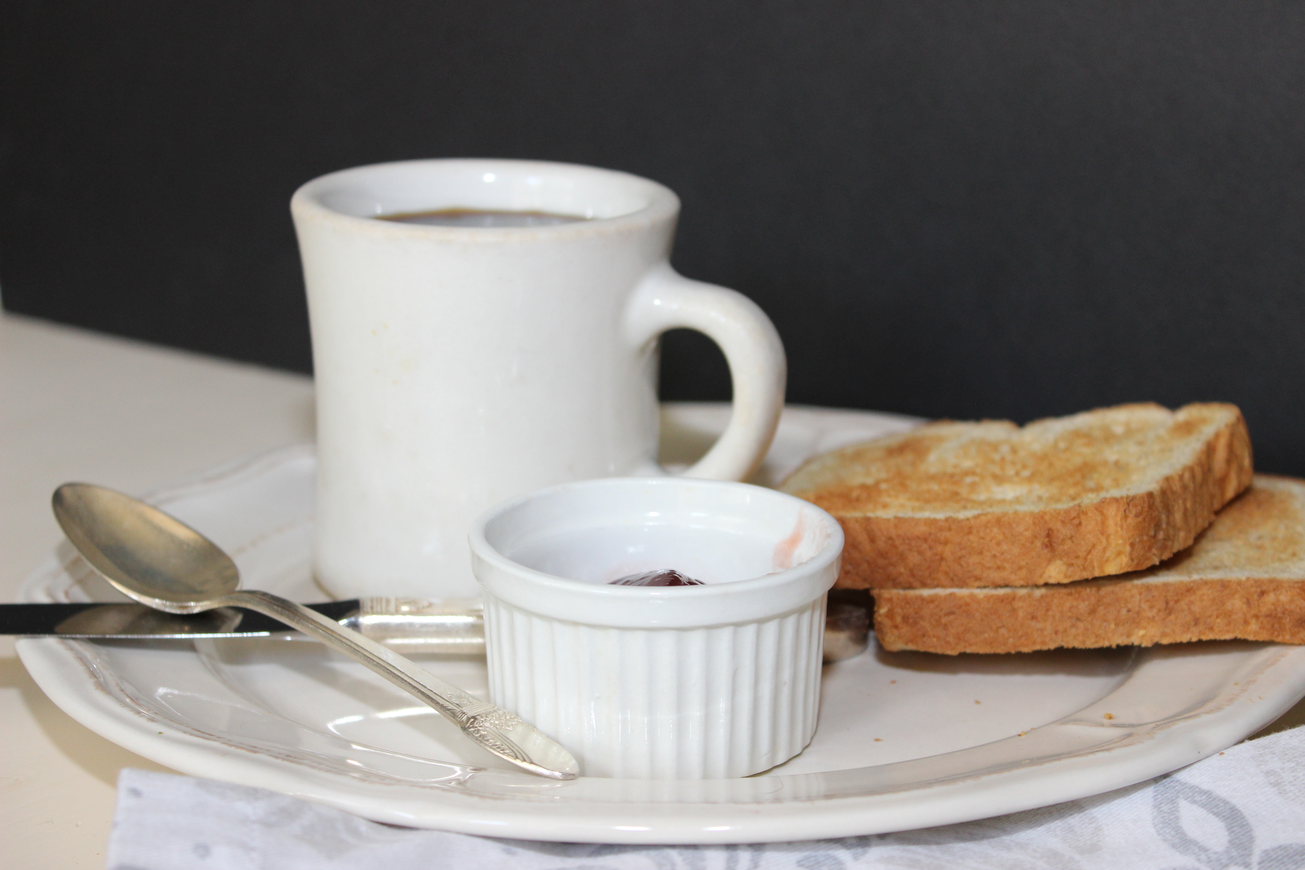
One of my two Victor mugs
original source, unknown

If you are of a “certain age” (ahem…..born before 1960), you might already recognize the Victor mug. Victor mugs are synonymous with American diners in the 50’s, 60’s, and 70’s. Ever wonder how and why they were made??? Of course you want to know! Why else are you reading this post?? After doing some research I can tell you everything you never knew you wanted to know about this most American of coffee cups.   So grab a cuppa and sit back and read on……

The Fred M. Locke Company was in Victor, New York in the late 19th century. The company produced ceramic insulators for telegraph lines to prevent interference during bad weather. Over the years the company expanded into other states and added other products in order to keep employees working during the war. (During WWII many factories either shut down or altered products to serve the military and the war effort.) The Victor factory changed history. Well, maybe it didn’t exactly change history, but it did add a piece of history to the war effort and thereby changed how Americans drank coffee for years.

In the early 1940’s the Navy asked for bids from US companies to develop a non-slip mug that could withstand the rigors of life aboard a ship and keep coffee hot. The shelf life of coffee mugs up until then was very short, what with the constant rocking of the ship, the mugs sliding around and banging into everything, or curses! even falling and breaking, not to mention the namby pamby porcelain they were made of.  Hot coffee was a must so it was important that it not end up on the deck. The requirements for the Navy were simple;  sturdy, non-slip and able to keep coffee hot.


Victor porcelain was fired for 72 hours at 2,250° F and could definitely keep coffee hot. (Bonus fact: it could also withstand 765,000 volts of electricity. Good to know for those obscure trivia games.)  No surprise, but Victor won the contract and the iconic mug began its  life on warships. Victor used a “dry foot” method of firing and this helped keep the mugs from slipping. If you feel around the bottom edge you’ll feel a matte, slightly rough edge. Just prior to going in the kiln, the mugs were wiped on a wet rubber mat which removed some of the glaze and prevented the mugs from sticking to the mat in the kiln. This method provided the mug with the non-slip ability the Navy needed and added no cost to the manufacturing process. A win, win.

Early mugs were without handles and are now prized by collectors. They are rare and hard to find. The Navy also requested sturdy, non-slip bowls and Victor supplied those as well.

source, Chris Clemens 3/6/16

The second design produced a cup with straight walls,  a slightly rounder base and a handle was added. The mug handles were formed in a plaster mold and were attached by hand. During the early part of the war there were only 3 “handle stickers,” all women because their fingers were smaller. Plus we all know that women are sticklers for detail, right? Those handles had to be smoothed and attached so that when fired the mugs would appear to be one piece. Men, were, too….burly for that job!

source, The Humble Victor Dining Mug, Sept 19, 2015 Huff Post

After the war the company decided that since they were already producing mugs and bowls they might as well continue and the mug went from being a staple aboard warships to being a staple in American diners.  Almost every diner in New York had Victor mugs….they were popular with the food service industry for the same reasons the Navy loved them, sturdy, non-slip and kept the coffee hot. Their popularity grew until they were standard in almost every diner in America and crossed into all branches of the military.

Source, Chris Clemens, March 6, 2016

Victor added a few colors and in the 60’s even added some art. The rare cobalt blue is highly prized today. It was part of a short run, along with other bright colors, but the company’s bread and butter was the classic white mug and that’s what they produced steadily for years. The mug was so popular that restaurant owners complained that customers and staff were stealing them. More than one wife discovered a Victor mug appearing by magic in her kitchen cupboard.

Chris Clemens, March 6, 2016

At the height of mug production the company had 15 handle stickers, and that created another problem…..if a mug had defects or failed, how would anyone know who added the handle? The early mugs used a painted logo and a genius within the company came up with a better idea. Each handle sticker was given a stamp that said Victor, but each one was just a little different, one letter was slightly askew or a bit wonky. It was easy to identify which handle sticker was responsible  in the event there were defects. Quality control was born.

While the 60’s and 70’s were the Victor mug’s hey day, the 80’s brought cheap Chinese knock-offs and flooded the market. The Victor mug cost the company about 81¢ to produce, while the chinese version retailed at 45¢! To add insult to injury the chinese stamped their mugs with “Victory” and a poorly processed “y” to make theirs look even more like the genuine mug. Victor responded by adding, “Made in the USA” to the bottoms. The company ultimately couldn’t compete financially and sold the factory to a few employees in 1984 and it was renamed, Victor Insulator, Inc. The mugs continued til about 1987 when Americans apparently decided price over quality was the deciding factor and the death of the Victor Mug was complete. The chinaware portion of the factory was closed.

Chris Clemens, March 6, 2016


While there are dozens of styles of coffee cups around today, I doubt that any will ever achieve the iconic status of the genuine Victor Mug.

And now that you know the story, will you hunt for a real Victor Mug? Will you drink your coffee from a cup that has history? You can find them for as little as $6.00 on Ebay or Etsy, and depending upon age and rarity, some will cost more. But these mugs can last a  lifetime so they are well worth the price.

Create your Sanctuary no matter where you live. Use simple things that have meaning. Choose vintage over reproduction.  


Source of information for this post: Fred M. Locke history page, Huffington Post, How Victor Changed the Coffee Mug
 

2018 COLORS OF THE YEAR

No, you didn’t read that title wrong. It does say “Colors of the Year” because today, my friends, I am listing this year’s chosen colors of some of the main paint companies. Since there is more than one paint company, there is more than one Color of the Year. (my intellect is a constant source of pride.)  2018 is the year of deep color it seems. Gone are the cool grays and warm tans of the last few years, and White wasn’t featured at all. Does this mean that you can’t paint your house/rooms gray or beige, or white? Of course not! Your house, your rules, your choices.  I enjoy learning what these companies decide are the “IT” colors for any given year. This year I had a couple of “ye god” moments….what were these people thinking? Who would paint their home Ultra Violet? Someone must have, or will…..and color is the easiest way to personalize your space or make a bold statement.

Even if you want to play it safe, there are still tons of whites, grays and tans to choose from. So go forth….paint something! So how do you use the dark, intense colors in a home decorated in modern farmhouse?  I’d use natural wood with any intense color and keep the décor minimal. Adding large plants instead of small tables loaded with knick knacks will help add life and keep rooms from being “over styled.” Bold colors speak for themselves. Instead of a busy gallery wall, try a set of 4 large botanical or nature inspired prints framed in natural wood over a credenza or sideboard or sofa. Add texture with throws and keep throw pillows large and to a minimum. Sea grass rugs add a natural, neutral foil for deep colors. The easiest way to use strong color is with a monochromatic color scheme. Layer various shades of the same color throughout the room. Have fun with it.

INTRODUCING BENJAMIN MOORE’S COLOR OF THE YEAR:  Caliente, Caliente is a deep, warm red, described as strong, radiant and full of energy. This would be delicious in a large dining room with beefy moldings (see what I did there? delicious and beefy?? ever the clever one I am)

PANTONE: The afore-mentioned Ultra Violet was at the top of Pantone’s list for this year. A rich, sexy, but bold color and not for someone afraid of going bold with intense hues. Probably best for modern, or bohemian spaces, would look stunning in a bedroom. The deep hue pictured below would provide a soothing envelope for sleep.

SHERWIN WILLIAMS:  Oceanside, a green blue described by the company as “opulent and mysterious.” Great for a bedroom or a library, but this color would look great in any room. 

VALSPAR went with “Favorite Green,” intense, invigorating with a touch of blue. I don’t see the blue undertones in the photo that was on the website for this shade, but as always, the light in a room can change how the “color reads” and computer monitors may show a slightly different shade. This is why getting sample pots and viewing a color for a few days in the room under various lighting is a must.

OLYMPIC PAINTS: Olympic’s choice is “Black Magic,” a true black with no undertones, which also describes GLIDDEN’S entry, Deep Onyx, a true black with no hints of blue. Great news for those of us who want to paint…say a door but don’t want a bluish black. My front door was painted in Valspar’s Tricorn and looks blue in the afternoon. So this year I’ll repaint with one of the two new entries for a true black. Black can work in any space,  even a small room would benefit from being painted black, the dark color makes walls seem to disappear and can help give an illusion of space.

Whatever your mood, there is a color for it. Paint is the cheapest and easiest tool in the home decorator’s tool box. If you don’t like it, “It’s just paint,” and for the cost of a couple gallons of another color, is easily changed. Unless your room is 4,000 square feet with soaring ceilings……might want to be careful selecting paint for that.  Just sayin.

Be bold! Or not. Create the home you see in your heart. Create your very own sanctuary, no matter where you live.  


SPRING TABLE

With apologies to my northern friends who have been inundated with snow, spring arrived early in Tampa Bay with record high temps in February, followed by a more normal round of weather the first week of March. Although it’s chilly now, about 20° below normal, flowers are already in bloom and butterflies are flitting. It’s going to warm up in time for St Patrick’s Day and I’ll once again pack up the jeans and sweats. Even though Spring isn’t officially here for several days, I decided to break out the spring décor, at least in the dining room.

This year’s table is a bit different, instead of my simple white bowl of eggs and pitcher filled with greens and a sprinkling of sheep on the table, I went with plants and gardening books, some vintage, some not and a cloche covering a nest……because what doesn’t look cool under a cloche?? To round things out, some rusty vintage garden tools. Easy and all things I had on hand, the small plants coming from my own propagations, so no money spent. That’s a bonus. As I view these photos, it’s looking a bit busy and who  knows how long it will stay this way…..but here it is, as it’s already changed a bit over the weeks.


It’s all about the layers and I began with a vintage crocheted table cloth as a base. Then layered it with books, plants, some candles and the vintage doodads. You can use anything in this kind of arrangement. Instead of gardening books, how about books on birds and butterflies? Or if books are scarce in your home, (WHAT???? Get some books people, reading is important!!) ) use cake plates and candle holders as risers for small potted plants instead of books. Add some ceramic birds picked up at Goodwill. Or the quintessential spring decor,  bunnies and/or sheep. Add eggs. Faux or real. Mine happen to be real quail eggs but I’ve seen some pretty good fauxs at the craft stores. Bird’s nests always say spring to me, even more than bunnies and sheep, which I equate more with Easter. Terra cotta pots can be substituted for the vintage white ones I used. Use what you have on hand.  I totally love my little vintage wildflower book, scored for a couple dollars last summer.


If you aren’t into small pots, use one large one and add garden tools, and a couple of bird nests for a simpler look.

Whatever you decide to use, layers and varying heights bring a display to life.

Using the books as risers and different sized pots adds some interest along with height variation to my table. The vignette is easily changed by adding some vintage bird postcards, or taking something away…. so the table can get a fresh look whenever I tire of looking at it. Which as you know, happens frequently here. Because after all, I’m fickle and nothing stays the same for very long here in the sanctuary. I’ve already added a couple of vintage brass hose end sprayers, and because that wasn’t enough crap, the garden tools got embellished with succulents. I’m all about the abundance of spring this year!

I hope you have a wonderful spring, filled with the promise of a fresh start, hope and renewal as we continue to travel through 2018.

Don’t forget to check out my Facebook page where I also share inspiration from other bloggers, and follow me on Instagram, I try to post something there every day.

Create the home you see in your heart. Create your own sanctuary no matter where you live. And as always, thank you for following along as I continue to create my own sanctuary, here in the burbs…. in my not a farmhouse.

SMALL DETAILS MATTER

SMALL DETAILS MATTER

I hate cords. But I like electricity. I’ve waged war on cords since I was old enough to see how lamps made light. I’ve covered them with fabric, I’ve hidden them with faux ivy (um….don’t judge) I’ve even painted them to match the walls. Good grief!

BEFORE, the dark brown cord made me twitchy

Getting power to the seemingly endless parade of electronics, can’t-live-without-gadgets and lights in my home is a tricky business what with the, “Can’t you hide those wires???” question to any new gadget Mr B installs for our modern day comfort and convenience. Geez, how did our ancestors live without internet???? (Blithely and without stupid lamp cords and cables and power strips, that’s how.)

I was staring at my table top recently and giving the brown lamp cord the stink eye. I was twitchy.  Cords have this effect on me. Why can’t lamp makers do something to make cords look better???? THEN….. a thought entered my mind, I don’t need no stinking lamp maker! I have Mr B!!! In an effort to make peace with my lamp cords, and give Mr B something to do, I asked him to rewire them with clear cord. He was SO grateful to have something to help make his life a little less boring and keep him away from the golf course! He jumped at the chance. I’m pretty sure he was singing my praises as he took the lamps into the garage…..and left, sans golf clubs….. for yet another trip to Lowes, this time for a wiring kit……make that several kits. He loves going to Lowes 3 or 4 times a day. Truly.

UGH

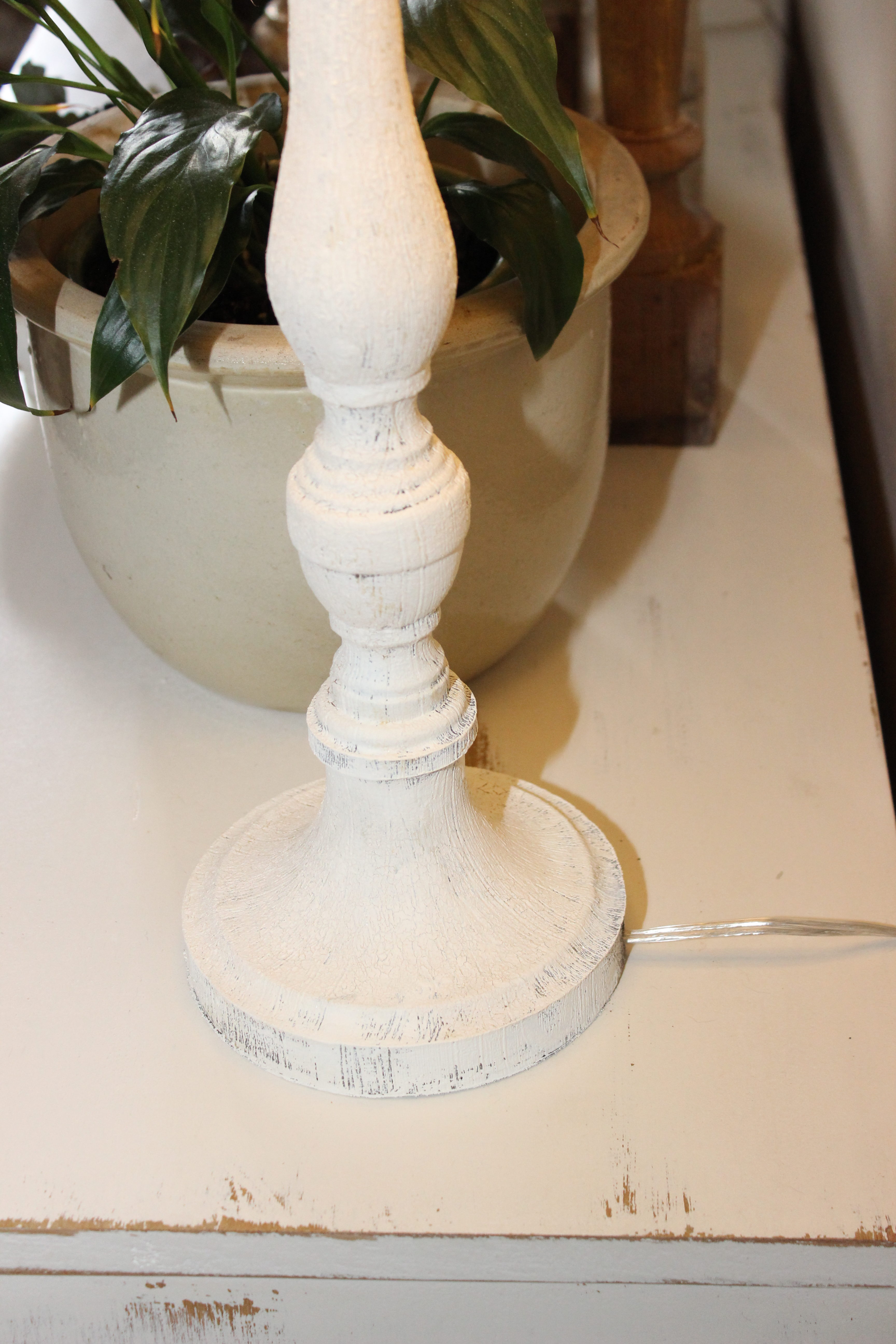
I gotta  say this was a GENIUS idea. I may not exactly love my lamps cords now but at least they don’t make me twitchy anymore. Switching to clear cords on the lamps on the white furniture is now the plan. I’ll leave the standard brown cords on the lamps for the dark bedroom furniture, but everything else is going clear. Most home improvement stores carry lamps kits with clear wire, and it’s a pretty easy task. Or maybe it’s just that Mr B makes it look easy. Whatever!  If cords make you twitchy feel free to steal this idea. You’re welcome. ( if you noticed I painted a couple of the lamps, you win the bonus round for most observant.) This isn’t a big project by any means, but it’s often the smallest of details that have the most impact.

AFTER, the clear cord isn’t nearly as twitch inducing and look at that subtle crackling on the lamp base!

Create the home you see in your heart. Create your Sanctuary no matter where you live.

Get each blog post delivered to your inbox! I promise I won't spam you.

Recent Comments
Follow Us